
3 Beautiful Member Onboarding Experiences
Quality member onboarding can mean the difference between highly engaged members who commit themselves to your content and members who feel lost and eventually churn.
One of the most important parts of the human experience is to feel valued.
If you want to keep people coming back to your membership site (and paying for it), you need to help them get the most out of your content – and it all starts with properly onboarding them so that they end up in the right place, at the right level, and consuming the right content for their needs.
In this post, we look at three beautiful membership onboarding experiences to give you inspiration for effectively onboarding your own members.
Beyond email sequences
We’ve talked about onboarding new members in terms of email sequences – which are certainly important and effective – but, if you run any kind of SaaS, or a membership site with different membership tiers or levels of content, it’s worth looking at web-based onboarding processes that place members into certain categories or starting points.
This kind of onboarding can make things a bit easier for everyone by reducing friction, and removing potential obstacles that might otherwise hinder member progress (such as learning how to navigate your site or completing redundant prerequisite content, for example).
The point is to help your members reach their goals, right? So, how can your onboarding experience achieve this?
Let’s look at our examples for some ideas.
Guideline
The onboarding process that 401k provider Guideline has created is noteworthy for its seamless and user-friendly design. Taking users from start to finish, there’s no extra clicking around, searching for setup options, or unnecessary steps that prolong the experience.
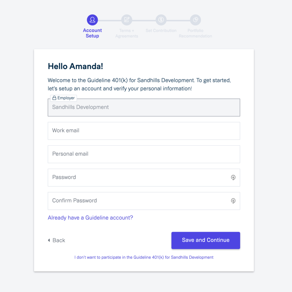
Clean design and a simple form with no distractions makes it quick and easy to enter the necessary information and move on. Just look at the account setup form and you can see that only minimal information is required, with signup and navigation options that are obvious and easy to read:
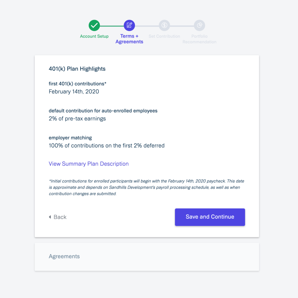
The next section shows the user’s progress through the onboarding experience by highlighting the completed section in green.
It also brings the terms and conditions (in this case, terms and agreements) front-and-center with concise and straight-foward language that’s palatable and easy to comprehend:
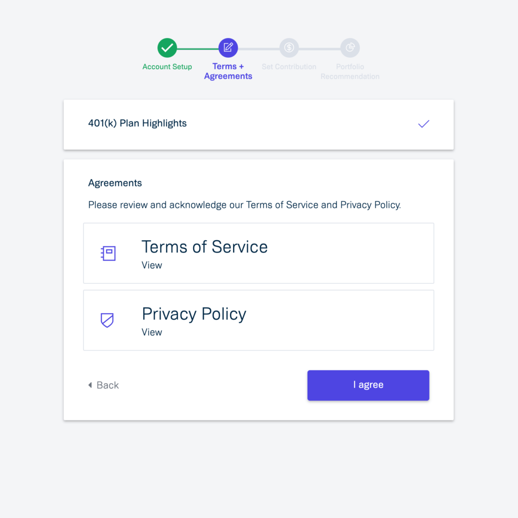
Continuing on, users are prompted to review and acknowledge the terms of service and privacy policy, with little room for confusion or unanswered questions:
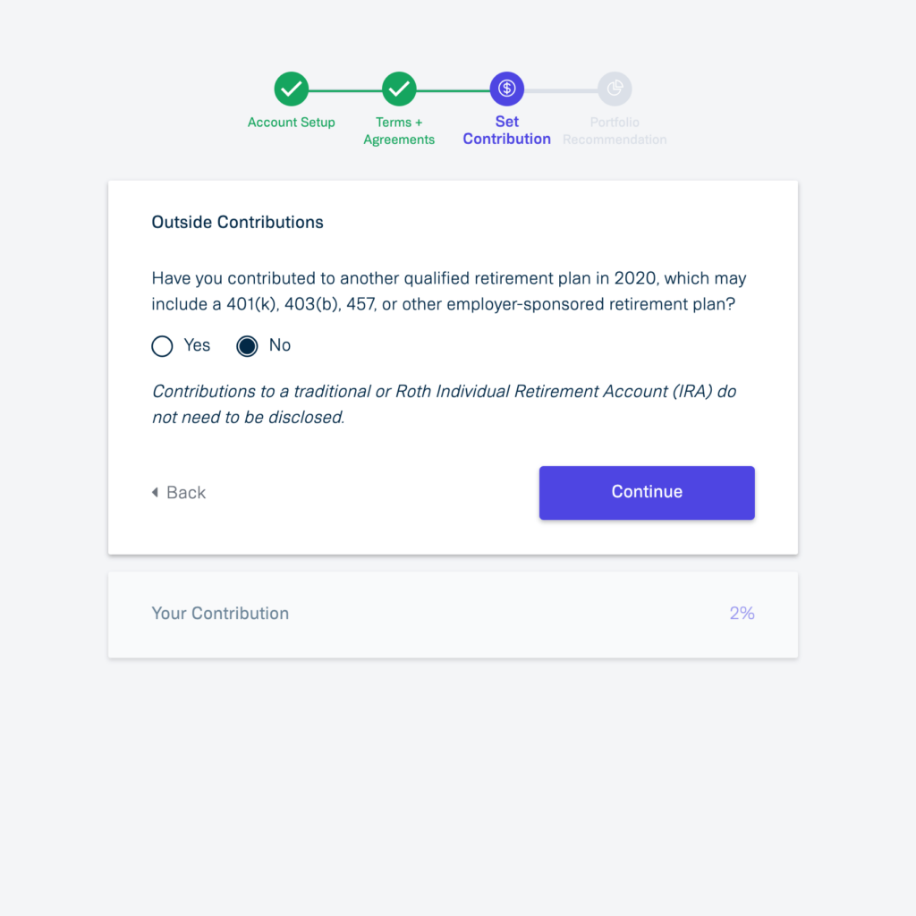
Now, we can see that we are halfway through the process, and it’s time to customize the user’s plan:
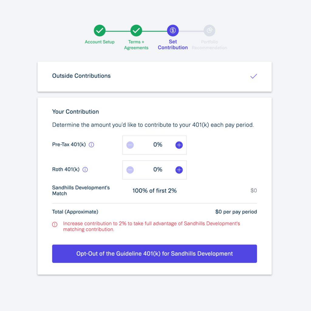
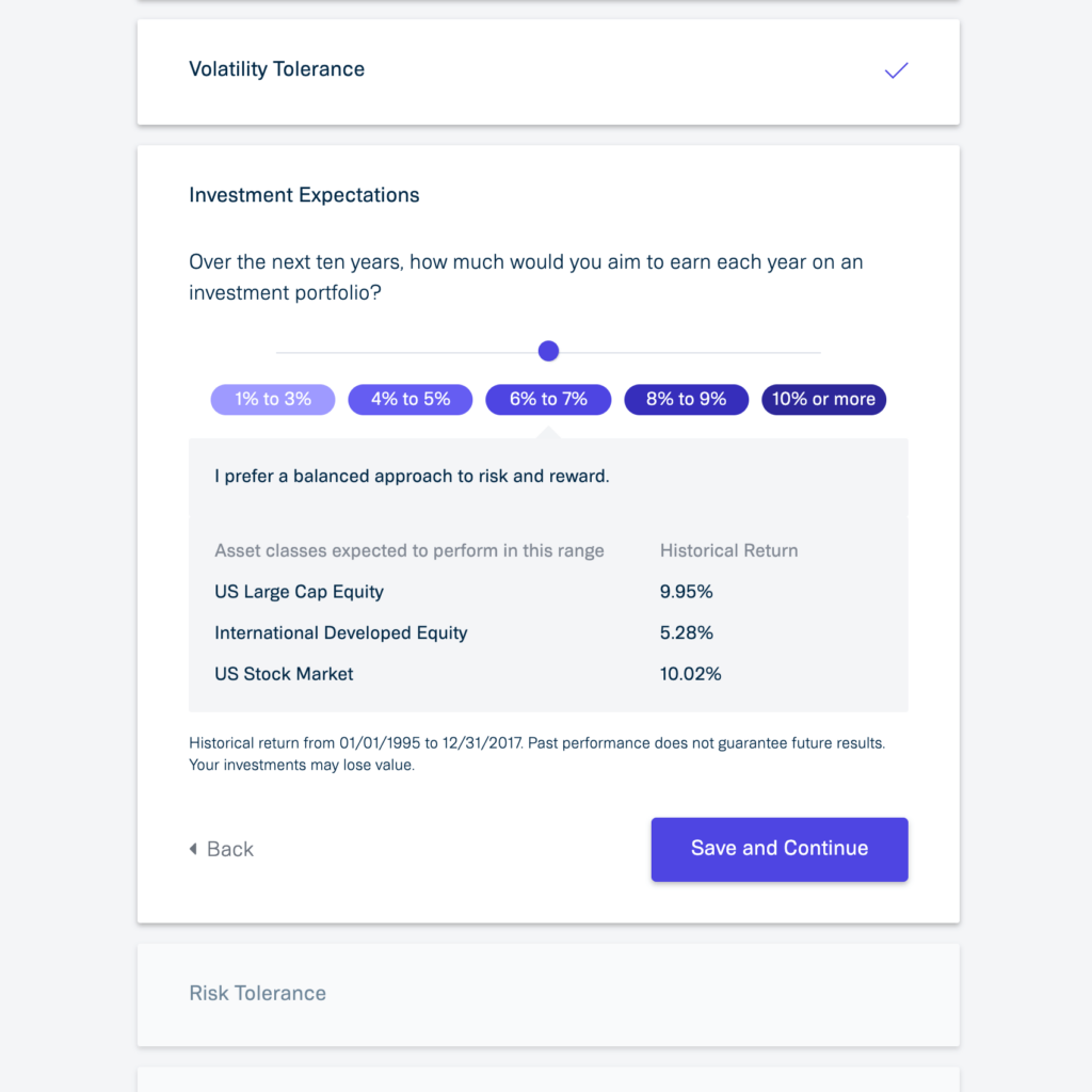
One of the elements that makes for a particularly user-friendly experience and requires less technical understanding – reducing friction – is the use of interactive sliders to qualify user responses:
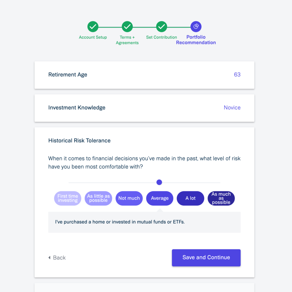
Not only are these sliders visually appealing; They also make it easy to differentiate between options, and show descriptions in layman’s terms:
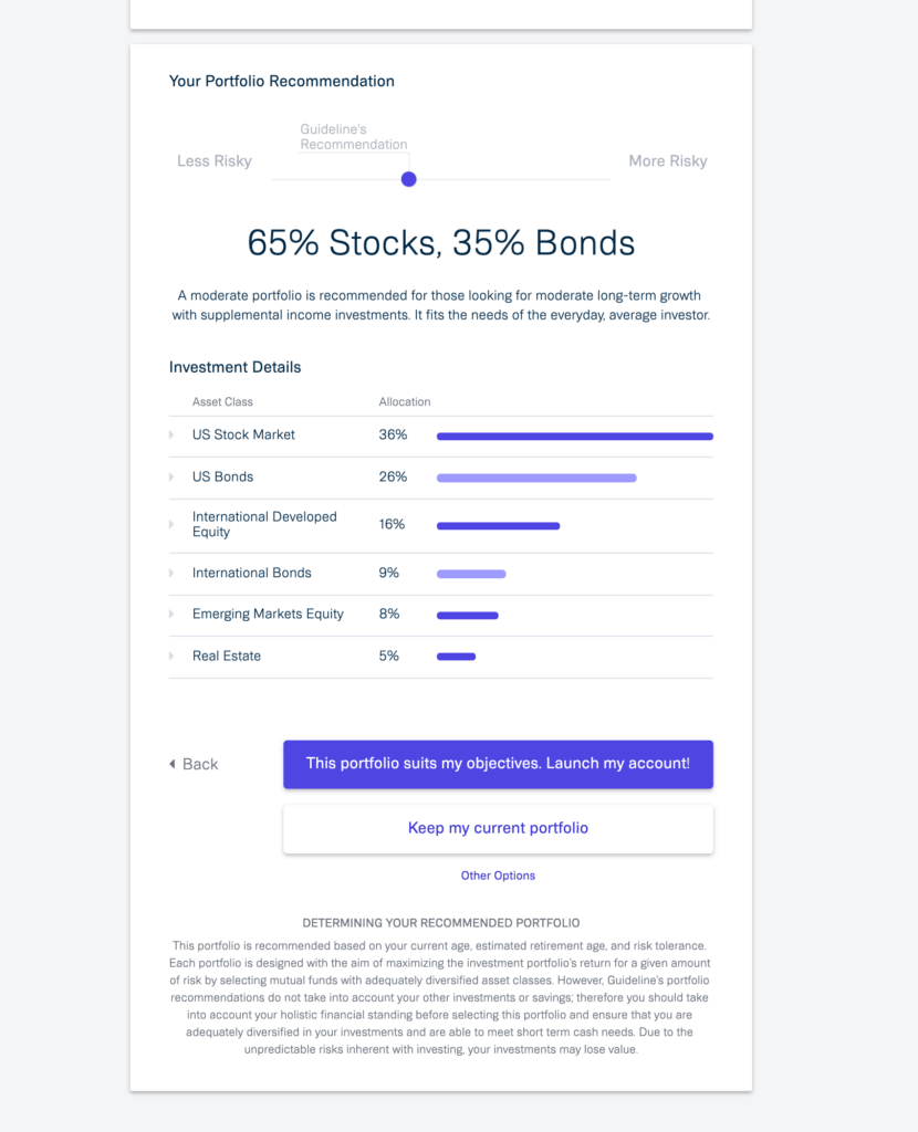
At the end of the onboarding process, Guideline gives the user a portfolio recommendation based on the responses submitted, along with an explanation of how the portfolio is determined, and the option to accept the recommendation or choose other options:
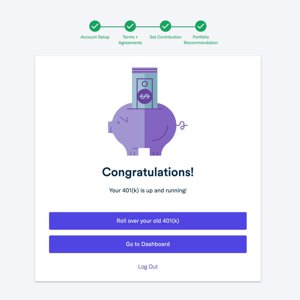
At this point, the onboarding process is complete, and the user gets a welcome message, the option to take further actions – in this case, to roll over an existing 401(k) – and a link that takes them directly to the user dashboard:
Key takeaways
- Remove friction and obstacles wherever possible
- Require as little information as necessary for users to get started
- Clean and simple design reduces potential confusion and makes for a more pleasant user experience
- Interactive elements like sliders are more user-friendly and add visual interest to what might otherwise be a more boring process
- At the end of an onboarding experience, quick access to the user dashboard makes it easy for users to get into the content right away
Duolingo
If your membership site is educational in nature, consider assessing new members according to their skill or knowledge level by giving them a placement test or questionnaire. Duolingo illustrates this perfectly!
Upon arriving to the Duolingo site, the user is prompted to get started right away:

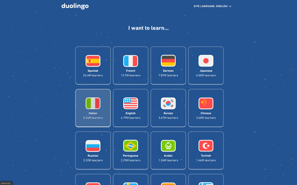
Then, it’s easy to select a language to learn:
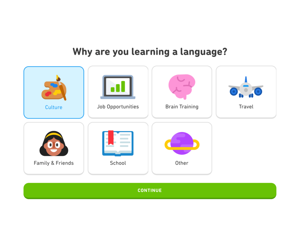
And now come the qualifying questions, which focus on the user’s goals – something that should always be at the forefront of your mind as a membership site owner!
In this case, Duolingo prompts the user to select a specific reason for learning a language. This can be applied to your own membership onboarding process either for the purpose of assigning a user to a specific member pathway, or simply as a survey question that can be used to fine-tune your content and marketing:
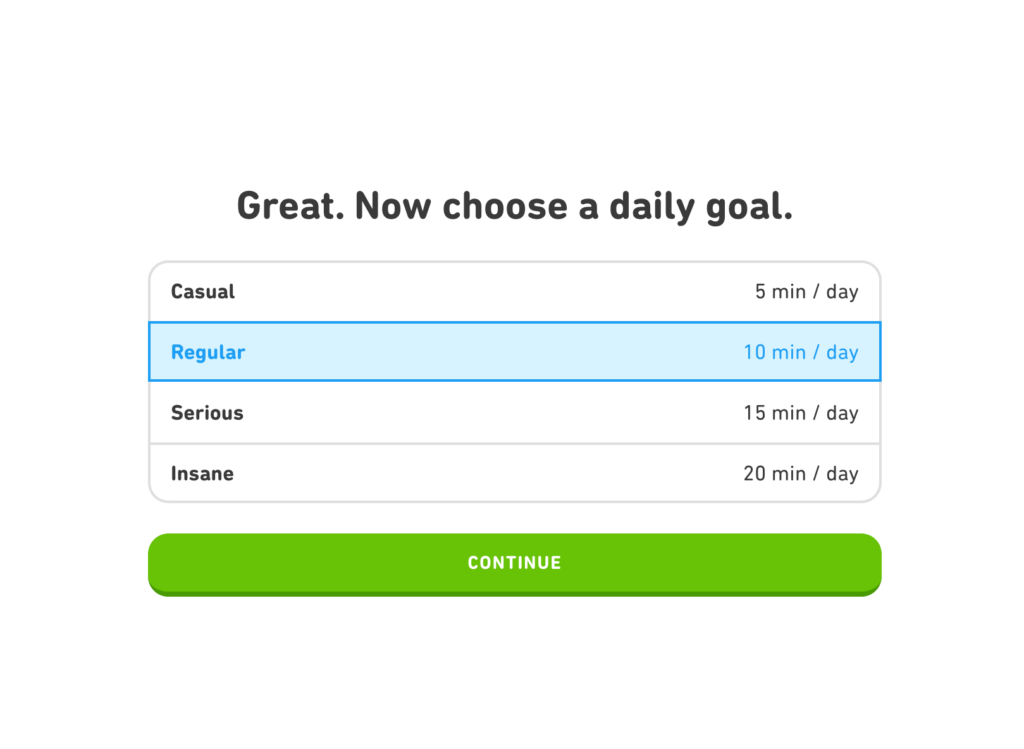
Next, users are asked how much time they want to dedicate to learning the language:
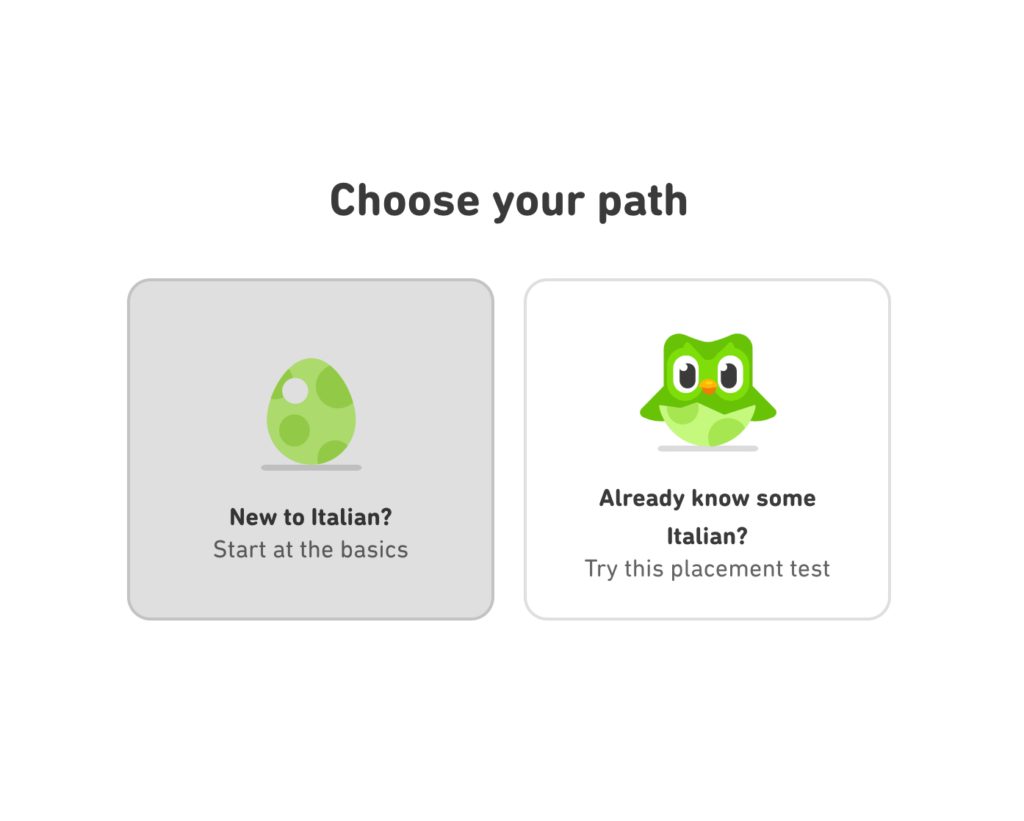
Then, users can choose between starting from the very beginning, or taking a placement test:
Once the beginner lesson or placement test is complete, users are shown game elements like points earned and other goals to complete:

To learn more about gamification and how you can use it to increase member engagement, check out the post we wrote about it over here!
Key takeaways
- Design your onboarding experience around the user’s goals
- Skill and knowledge assessments (tests or questionnaires) are particularly useful for educational memberships
- Gamification makes the onboarding process more fun and engaging for users
Headliner
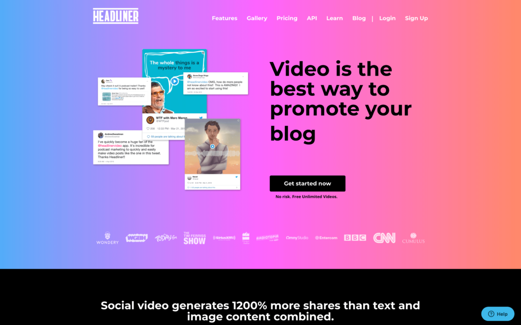
Headliner’s visually stunning website makes it easy to point out as an example of a truly beautiful onboarding process. There’s something to be said for an engaging design that gets members excited about the product or content and motivates them to complete onboarding and get down to business.
Additionally, some membership sites like Headliner simply don’t require as many pre-qualifying questions as educational sites like Duolingo or products like Guideline, because it’s more about creating output with the SaaS, as opposed to learning extensive material or managing account options.
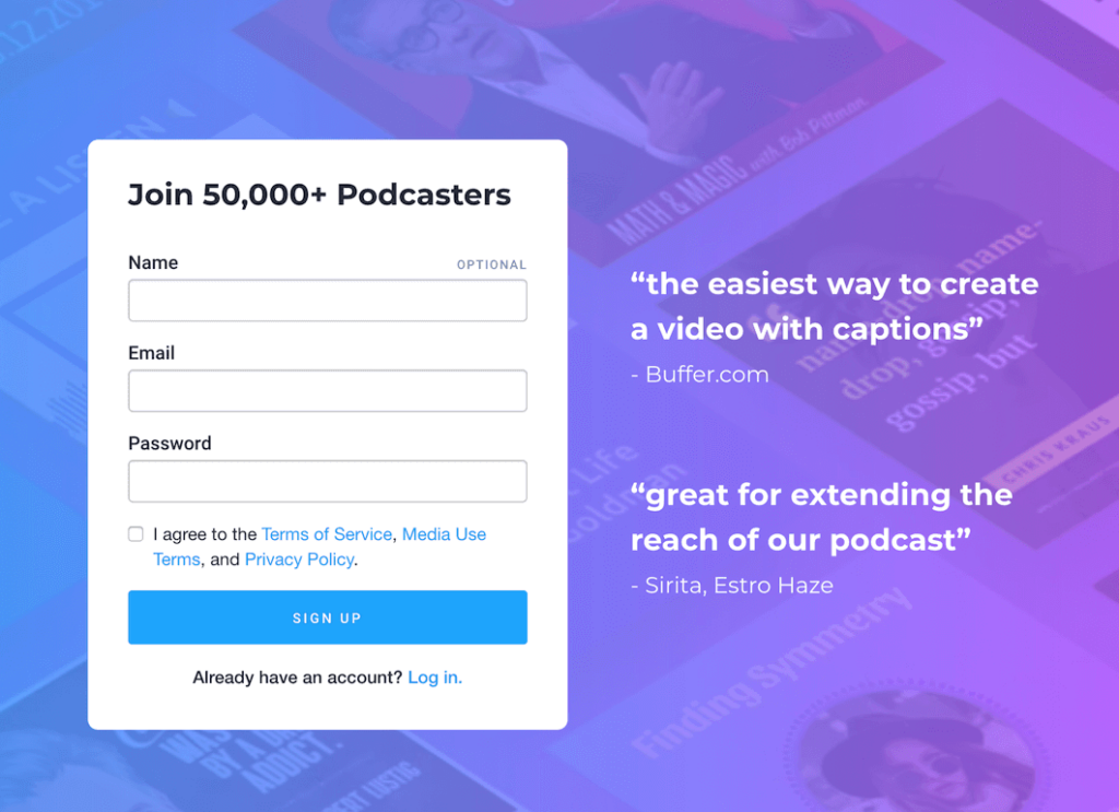
Like the other two examples mentioned, Headliner has a clean and simple sign-up form that makes it easy to get right into the onboarding process with minimal personal information:
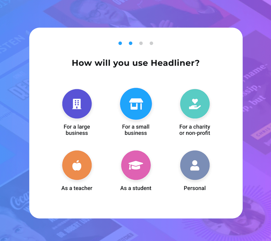
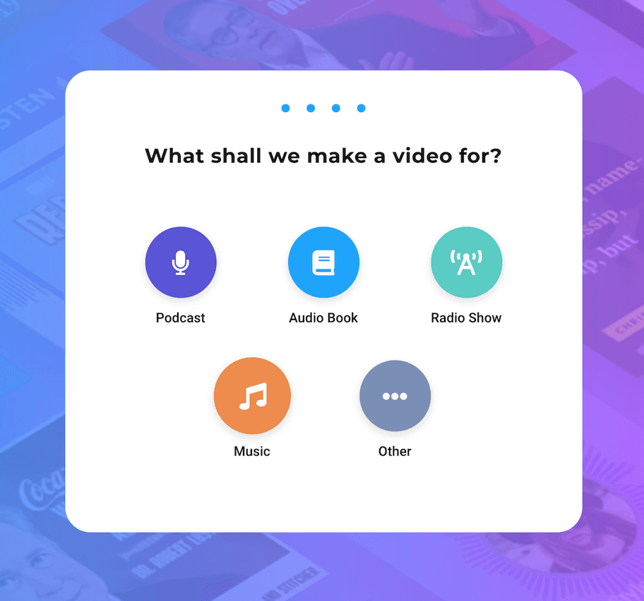
Once the user signs up, there’s a welcome message to kick things off, followed by a question to determine how the user plans to use the product:

Next, Headliner shows how you can go beyond basic onboarding and get more out of these crucial moments with a new user. At this point, the user has shown enough interest to sign up in the first place and is actively engaged in the onboarding process. So, now is the perfect opportunity to prompt a newsletter signup:

And with just one more question to help direct users to the most appropriate tools on the site for their needs, onboarding is nearly finished:
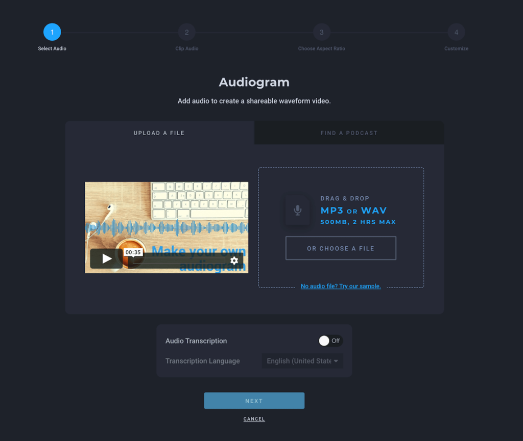
But it doesn’t stop there. Once the user selects the type of video they want to make, they are taken directly to that specific tool, with step-by-step guidance for completing an actual video:
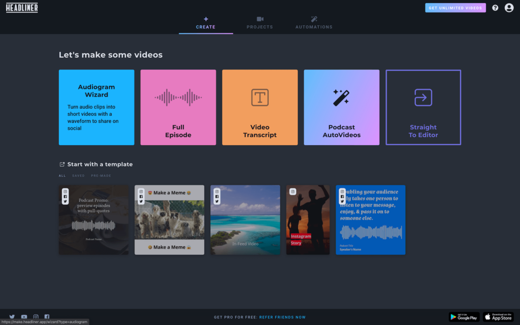
And finally, the user dashboard offers templates and easy access to different tools, so that the user can quickly find what they are looking for and get started, regardless of experience.
Key takeaways
- Visual appeal helps to excite and motivate users
- Not all membership sites require more than a few qualifying questions
- You can use the onboarding process to prompt other actions, such as newsletter signups
- Guidance isn’t just limited to the initial onboarding process; It can extend to the content, tools, or products themselves to help users get rolling and gain momentum
Don’t be afraid to get creative with member onboarding
Although a lot of membership sites – particularly those that focus on educational tools and content – tend to have somewhat standard onboarding processes, there’s always room for creativity!
Plus, as membership sites become more and more popular, it will continue to be important to distinguish yourself. So, when designing your own don’t be afraid to do something different and put your own spin on things.
Hopefully these three examples have given you some inspiration. Do you have any great membership onboarding examples to share with us? What has been effective for your own membership onboarding process? Let us know in the comments below!
Illustration by Jessica Johnston.