
Is your site design losing you members?
There are many elements that contribute to member retention – from membership pricing, to the rate that you replenish your site with quality, fresh content.
But when it comes to everyday use, your site design can truly make or break the member experience!
Whether you’ve had a harder time with member retention or you’re just looking to make general improvements, auditing your site design can reveal blind spots and trouble areas that you might not have noticed before. As you turn over every stone, remember that it’s all about your members! What do members value in a membership? What makes them stick around? In your quest to create meaningful memberships, site design should be at the top of your priority list because, well, members are specifically paying for access to your site itself (and of course, your content)!
Let’s take a look at some important site design tips for maximizing the member experience and boosting retention!
Monitor user activity
Before you can do much to address any specific issues, you’ll want to get a general sense of user activity on your site. Where are your customers are spending their time? What’s working and what’s not? Which areas are getting too little attention? Google Analytics and similar tools can help you monitor your traffic and page patterns, and learn more about your site visitors through performance measurements and data.
If you’re interested in learning even more about where members are interacting and engaging on your site, heat mapping tools like Crazy Egg and Mouseflow give you a visual representation site interactions, so you have detailed data and insights to work with when deciding what to work on.
User friendliness is #1
Imagine you’ve just joined a membership site that has a ton of content you are really excited about and interested in, only to find that the site is slow, clunky, difficult to navigate, and unattractive – you might think twice about renewing! From the member’s perspective, it’s easy to get overwhelmed by things like excessive text and images, content that’s hard to find, or an awkward user interface. Do your best to avoid things like auto-playing videos and page sliders, pop-ups, or other distracting elements that can get in the way.
Clean, contemporary, and minimal designs are more than just stylistic trends; they also help to create the sense that your site is well organized and thoughtfully designed. Sticking to the essentials and avoiding unnecessary elements that take up extra space make it easier for your members to find what they’re looking for – and enjoy the experience while they’re at it!
Optimize your member area or dashboard
This is where your members will engage with your site the most, so you want to pay the most attention don’t want to neglect it! For starters, a well-structured account page can go a long way when it comes to facilitating the use of your site, and it also shows your members they’re a priority. Make it easy for your members to see their purchase history, access any purchased products and gated content, view and update their account information and settings, and track affiliate commissions (if applicable).
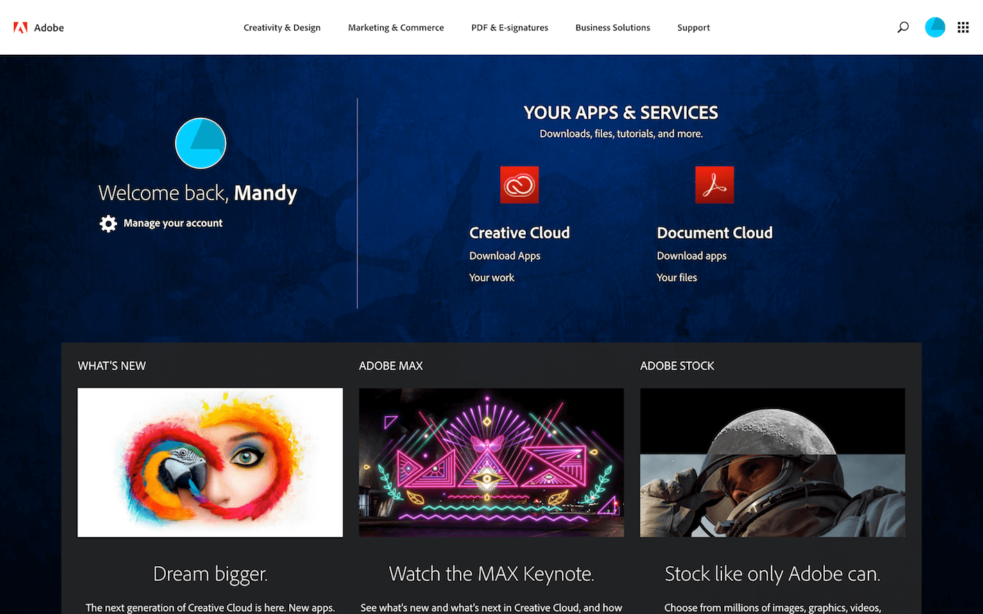
Member area with easy access to downloads (Adobe)
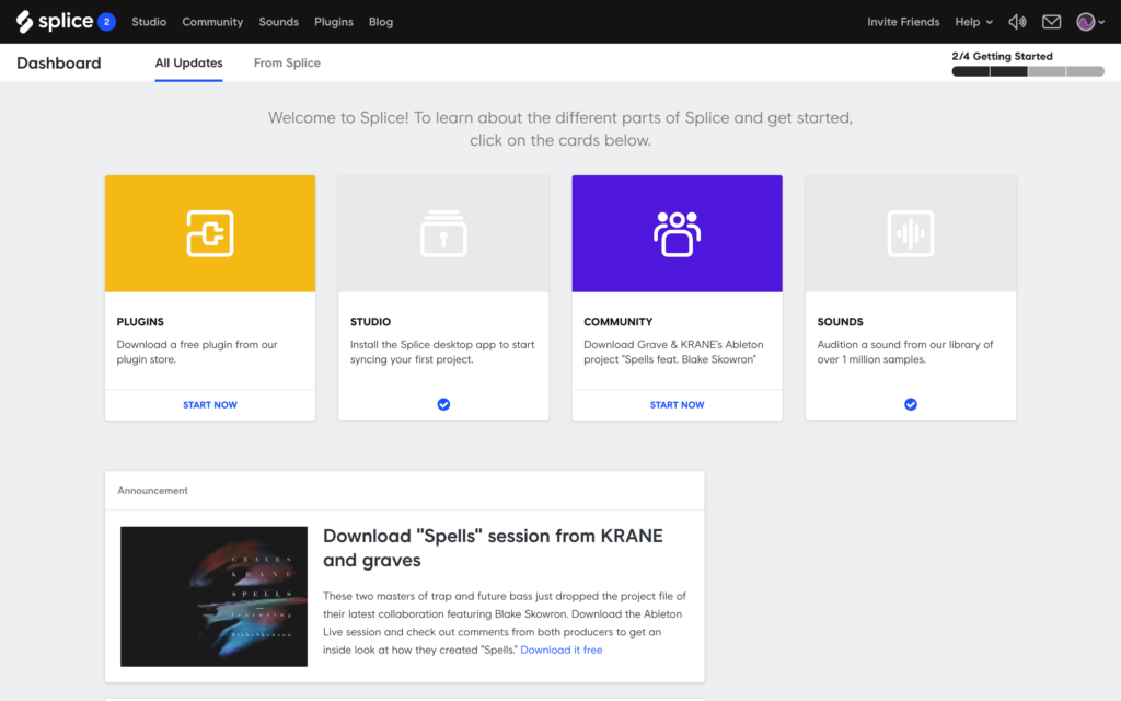
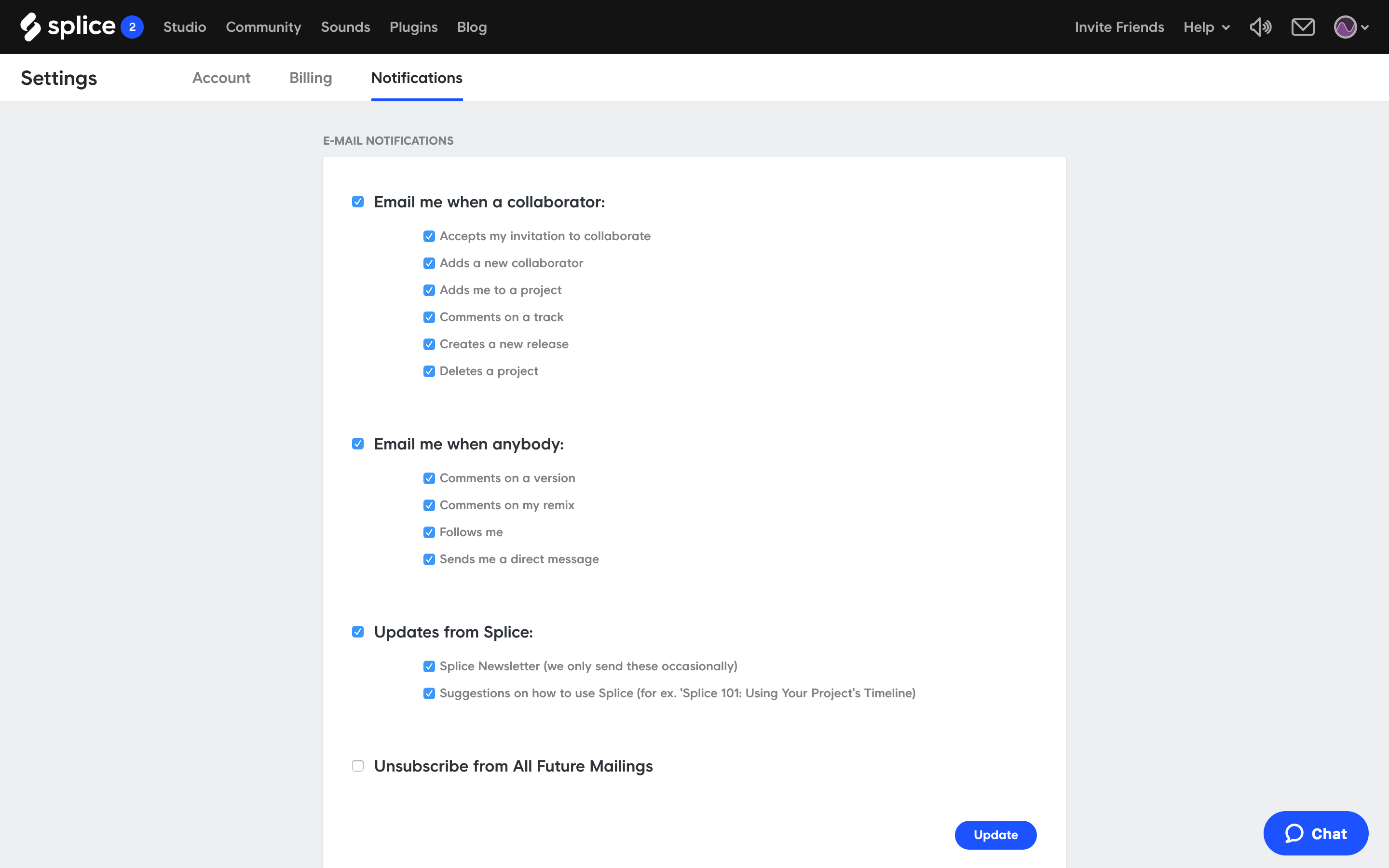
Member dashboard, including easy access to billing information and notification settings (Splice)
Clearly display any essential information
You want your site to be the go-to place for your members, containing everything they need to get the most out of their memberships. This means that the most important information should be easily accessible, readable, and forthcoming. From a clear pricing structure and a thorough and easy-to-understand FAQ section or support database, to a detailed, but readable license agreement and any other relevant informational elements, think about anything that you would want to be aware of as a member – and make it easily available!
Make member support & subscription cancellation easy to find
One of the most frustrating things for members is having difficulty finding support forms or emails. Ideally, your members should be able to get in touch with you in just a click or two. Put a link to your contact page in the header or footer of your site to keep it simple.
And although you don’t want to encourage it, your members should also have the option to cancel their membership in an easy and straightforward manner, without having to contact you. This makes for a better user experience, and helps cut down on your support tickets, too!
Be sure your branding elements are consistent and cohesive
Do you have call-to-action buttons or other branded page elements? Use them consistently, with the same color, size, and style in every instance for a clean and uniform look. Check your different pages and sections to be sure that they all conform to your site-wide design and formatting choices, including blog posts, product descriptions, and content pages. Consistent branding makes for a more pleasing aesthetic experience and also helps to delineate your site’s structure.
Carefully audit your web copy
Take the time to check through your web copy for correct spelling, grammar, and syntax, and identify any areas that need improvement. Consider hiring a copywriter or editor to polish up your product descriptions, brand slogans, about page, contact page, blog posts, and any other text content. Even if you’re not losing members, it’s good to do a periodic “check up” on your site!
Address speed and mobile responsiveness
Is your site fast-loading? Do you have consistent server issues, or worse – regular down time? Consider checking into using a different server if that’s the problem, or “cut the fat” and use themes that are less bloated if your site takes more than a few seconds to load. Use online tools like Google PageSpeed Insights or GTmetrix to get specific performance insights that can help you identify any problem areas.
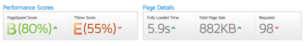
Example results on GTmetrix
You’ll also want to double check to see how your site loads on different devices such as mobile phones and tablets vs. desktop computers. Mobile devices are the primary devices for many people, so there’s a good chance that a decent amount of your site traffic comes from them. You want to be extra sure that your site is designed with mobile functionality in mind. Do your site elements scale nicely? Are there any elements that don’t work properly on mobile devices? You may need to find a workaround or alternate option to account for those elements.
Consider sending out surveys for feedback
Want to find out for sure if there’s anything about your site that your members don’t like? Send out a survey! Asking your members to give you feedback on specific things like their membership site experience allows you to be more informed when it’s time to make changes. Many loyal customers will be happy to help you out, and if you aren’t getting enough responses, you can always offer something in exchange for their time, like 30% off of next month’s dues, an exclusive download, etc. You might also consider including a few website-related questions in the survey if members do cancel, so they have the option of letting you know if it was a factor in their decision to leave.
Keep your members in mind at all times
It can be tempting to make design decisions exclusively according your own personal taste, but prioritizing the member experience will always benefit you in the end – along with your members! Remember: In this day and age, speed and efficiency, seamless functionality, and ease of mobile use are all in high demand, so keep that in mind as you make adjustments. Of course, your site design should always reflect your own brand values, too!
What have you found to be most effective when it comes to membership site design? Leave us a comment below to join the conversation!